/**
 * @output wp-admin/js/color-picker.js
 */

( function( $, undef ) {

	var ColorPicker,
		_before = '<button type="button" class="button wp-color-result" aria-expanded="false"><span class="wp-color-result-text"></span></button>',
		_after = '<div class="wp-picker-holder" />',
		_wrap = '<div class="wp-picker-container" />',
		_button = '<input type="button" class="button button-small" />',
		_wrappingLabel = '<label></label>',
		_wrappingLabelText = '<span class="screen-reader-text"></span>',
		__ = wp.i18n.__;

	/**
	 * Creates a jQuery UI color picker that is used in the theme customizer.
	 *
	 * @class $.widget.wp.wpColorPicker
	 *
	 * @since 3.5.0
	 */
	ColorPicker = /** @lends $.widget.wp.wpColorPicker.prototype */{
		options: {
			defaultColor: false,
			change: false,
			clear: false,
			hide: true,
			palettes: true,
			width: 255,
			mode: 'hsv',
			type: 'full',
			slider: 'horizontal'
		},
		/**
		 * Creates a color picker that only allows you to adjust the hue.
		 *
		 * @since 3.5.0
		 * @access private
		 *
		 * @return {void}
		 */
		_createHueOnly: function() {
			var self = this,
				el = self.element,
				color;

			el.hide();

			// Set the saturation to the maximum level.
			color = 'hsl(' + el.val() + ', 100, 50)';

			// Create an instance of the color picker, using the hsl mode.
			el.iris( {
				mode: 'hsl',
				type: 'hue',
				hide: false,
				color: color,
				/**
				 * Handles the onChange event if one has been defined in the options.
				 *
				 * @ignore
				 *
				 * @param {Event} event    The event that's being called.
				 * @param {HTMLElement} ui The HTMLElement containing the color picker.
				 *
				 * @return {void}
				 */
				change: function( event, ui ) {
					if ( typeof self.options.change === 'function' ) {
						self.options.change.call( this, event, ui );
					}
				},
				width: self.options.width,
				slider: self.options.slider
			} );
		},
		/**
		 * Creates the color picker, sets default values, css classes and wraps it all in HTML.
		 *
		 * @since 3.5.0
		 * @access private
		 *
		 * @return {void}
		 */
		_create: function() {
			// Return early if Iris support is missing.
			if ( ! $.support.iris ) {
				return;
			}

			var self = this,
				el = self.element;

			// Override default options with options bound to the element.
			$.extend( self.options, el.data() );

			// Create a color picker which only allows adjustments to the hue.
			if ( self.options.type === 'hue' ) {
				return self._createHueOnly();
			}

			// Bind the close event.
			self.close = self.close.bind( self );

			self.initialValue = el.val();

			// Add a CSS class to the input field.
			el.addClass( 'wp-color-picker' );

			/*
			 * Check if there's already a wrapping label, e.g. in the Customizer.
			 * If there's no label, add a default one to match the Customizer template.
			 */
			if ( ! el.parent( 'label' ).length ) {
				// Wrap the input field in the default label.
				el.wrap( _wrappingLabel );
				// Insert the default label text.
				self.wrappingLabelText = $( _wrappingLabelText )
					.insertBefore( el )
					.text( __( 'Color value' ) );
			}

			/*
			 * At this point, either it's the standalone version or the Customizer
			 * one, we have a wrapping label to use as hook in the DOM, let's store it.
			 */
			self.wrappingLabel = el.parent();

			// Wrap the label in the main wrapper.
			self.wrappingLabel.wrap( _wrap );
			// Store a reference to the main wrapper.
			self.wrap = self.wrappingLabel.parent();
			// Set up the toggle button and insert it before the wrapping label.
			self.toggler = $( _before )
				.insertBefore( self.wrappingLabel )
				.css( { backgroundColor: self.initialValue } );
			// Set the toggle button span element text.
			self.toggler.find( '.wp-color-result-text' ).text( __( 'Select Color' ) );
			// Set up the Iris container and insert it after the wrapping label.
			self.pickerContainer = $( _after ).insertAfter( self.wrappingLabel );
			// Store a reference to the Clear/Default button.
			self.button = $( _button );

			// Set up the Clear/Default button.
			if ( self.options.defaultColor ) {
				self.button
					.addClass( 'wp-picker-default' )
					.val( __( 'Default' ) )
					.attr( 'aria-label', __( 'Select default color' ) );
			} else {
				self.button
					.addClass( 'wp-picker-clear' )
					.val( __( 'Clear' ) )
					.attr( 'aria-label', __( 'Clear color' ) );
			}

			// Wrap the wrapping label in its wrapper and append the Clear/Default button.
			self.wrappingLabel
				.wrap( '<span class="wp-picker-input-wrap hidden" />' )
				.after( self.button );

			/*
			 * The input wrapper now contains the label+input+Clear/Default button.
			 * Store a reference to the input wrapper: we'll use this to toggle
			 * the controls visibility.
			 */
			self.inputWrapper = el.closest( '.wp-picker-input-wrap' );

			el.iris( {
				target: self.pickerContainer,
				hide: self.options.hide,
				width: self.options.width,
				mode: self.options.mode,
				palettes: self.options.palettes,
				/**
				 * Handles the onChange event if one has been defined in the options and additionally
				 * sets the background color for the toggler element.
				 *
				 * @since 3.5.0
				 *
				 * @ignore
				 *
				 * @param {Event} event    The event that's being called.
				 * @param {HTMLElement} ui The HTMLElement containing the color picker.
				 *
				 * @return {void}
				 */
				change: function( event, ui ) {
					self.toggler.css( { backgroundColor: ui.color.toString() } );

					if ( typeof self.options.change === 'function' ) {
						self.options.change.call( this, event, ui );
					}
				}
			} );

			el.val( self.initialValue );
			self._addListeners();

			// Force the color picker to always be closed on initial load.
			if ( ! self.options.hide ) {
				self.toggler.click();
			}
		},
		/**
		 * Binds event listeners to the color picker.
		 *
		 * @since 3.5.0
		 * @access private
		 *
		 * @return {void}
		 */
		_addListeners: function() {
			var self = this;

			/**
			 * Prevent any clicks inside this widget from leaking to the top and closing it.
			 *
			 * @since 3.5.0
			 *
			 * @param {Event} event The event that's being called.
			 *
			 * @return {void}
			 */
			self.wrap.on( 'click.wpcolorpicker', function( event ) {
				event.stopPropagation();
			});

			/**
			 * Open or close the color picker depending on the class.
			 *
			 * @since 3.5.0
			 */
			self.toggler.on( 'click', function(){
				if ( self.toggler.hasClass( 'wp-picker-open' ) ) {
					self.close();
				} else {
					self.open();
				}
			});

			/**
			 * Checks if value is empty when changing the color in the color picker.
			 * If so, the background color is cleared.
			 *
			 * @since 3.5.0
			 *
			 * @param {Event} event The event that's being called.
			 *
			 * @return {void}
			 */
			self.element.on( 'change', function( event ) {
				var me = $( this ),
					val = me.val();

				if ( val === '' || val === '#' ) {
					self.toggler.css( 'backgroundColor', '' );
					// Fire clear callback if we have one.
					if ( typeof self.options.clear === 'function' ) {
						self.options.clear.call( this, event );
					}
				}
			});

			/**
			 * Enables the user to either clear the color in the color picker or revert back to the default color.
			 *
			 * @since 3.5.0
			 *
			 * @param {Event} event The event that's being called.
			 *
			 * @return {void}
			 */
			self.button.on( 'click', function( event ) {
				var me = $( this );
				if ( me.hasClass( 'wp-picker-clear' ) ) {
					self.element.val( '' );
					self.toggler.css( 'backgroundColor', '' );
					if ( typeof self.options.clear === 'function' ) {
						self.options.clear.call( this, event );
					}
				} else if ( me.hasClass( 'wp-picker-default' ) ) {
					self.element.val( self.options.defaultColor ).change();
				}
			});
		},
		/**
		 * Opens the color picker dialog.
		 *
		 * @since 3.5.0
		 *
		 * @return {void}
		 */
		open: function() {
			this.element.iris( 'toggle' );
			this.inputWrapper.removeClass( 'hidden' );
			this.wrap.addClass( 'wp-picker-active' );
			this.toggler
				.addClass( 'wp-picker-open' )
				.attr( 'aria-expanded', 'true' );
			$( 'body' ).trigger( 'click.wpcolorpicker' ).on( 'click.wpcolorpicker', this.close );
		},
		/**
		 * Closes the color picker dialog.
		 *
		 * @since 3.5.0
		 *
		 * @return {void}
		 */
		close: function() {
			this.element.iris( 'toggle' );
			this.inputWrapper.addClass( 'hidden' );
			this.wrap.removeClass( 'wp-picker-active' );
			this.toggler
				.removeClass( 'wp-picker-open' )
				.attr( 'aria-expanded', 'false' );
			$( 'body' ).off( 'click.wpcolorpicker', this.close );
		},
		/**
		 * Returns the iris object if no new color is provided. If a new color is provided, it sets the new color.
		 *
		 * @param newColor {string|*} The new color to use. Can be undefined.
		 *
		 * @since 3.5.0
		 *
		 * @return {string} The element's color.
		 */
		color: function( newColor ) {
			if ( newColor === undef ) {
				return this.element.iris( 'option', 'color' );
			}
			this.element.iris( 'option', 'color', newColor );
		},
		/**
		 * Returns the iris object if no new default color is provided.
		 * If a new default color is provided, it sets the new default color.
		 *
		 * @param newDefaultColor {string|*} The new default color to use. Can be undefined.
		 *
		 * @since 3.5.0
		 *
		 * @return {boolean|string} The element's color.
		 */
		defaultColor: function( newDefaultColor ) {
			if ( newDefaultColor === undef ) {
				return this.options.defaultColor;
			}

			this.options.defaultColor = newDefaultColor;
		}
	};

	// Register the color picker as a widget.
	$.widget( 'wp.wpColorPicker', ColorPicker );
}( jQuery ) );
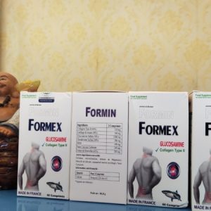
CVARA – NHẬP KHẨU PHÁP – GIÚP PHÁT TRIỂN CHIỀU CAO VÀ PHÒNG CHỐNG LOÃNG XƯƠNG.
390,000₫
CVARA – NHẬP KHẨU PHÁP – BỔ SUNG CALCI NANO VITAMIN D3 VÀ MK7 – GIÚP PHÁT TRIỂN CHIỀU CAO VÀ PHÒNG CHỐNG LOÃNG XƯƠNG.
CVARA – NHẬP KHẨU PHÁP – BỔ SUNG CALCI NANO VITAMIN D3 VÀ MK7 – GIÚP PHÁT TRIỂN CHIỀU CAO VÀ PHÒNG CHỐNG LOÃNG XƯƠNG
– Bổ sung Canxi nhằm hỗ trợ phát triển chiều cao cho thanh thiếu niên trong độ tuổi phát triển chiều cao, giúp xương chắc khỏe, phòng ngừa còi xương ở trẻ em
– Chống loãng xương, giúp phục hồi xương gãy, giảm đau lưng cho người lớn, ngăn chặn các hiện tượng thoái hóa, giòn xương do thiếu canxi trong máu, giúp cơ thể khỏe mạnh
– Giảm tình trạng viêm khớp, thoái hóa khớp. Cung cấp canxi, vitamin D3 cho phụ nữ có thai và cho con bú. Tăng cường và phát triển hệ xương ở thai nhi
– Giảm tê bì chân tay, chuột rút. Kết hợp hỗ trợ điều trị thiếu canxi huyết
CAM KẾT HÀNG CHÍNH HÃNG – GIÁ CẢ HỢP LÝ – TIẾT KIỆM 5-7% – GIAO HÀNG TOÀN QUỐC.


