/home/ytevagd/domains/ytevagiadinh.com/public_html/wp-admin/css/about-rtl.css
/*! This file is auto-generated */
/*------------------------------------------------------------------------------
  22.0 - About Pages

   1.0 Global: About, Credits, Freedoms, Privacy, Get Involved
    1.1 Layout
    1.2 Typography & Elements
    1.3 Header
   2.0 Credits Page
   3.0 Freedoms Page
   4.0 Privacy Page
   x.2.0 Legacy About Styles: Global
    x.2.1 Typography
    x.2.2 Structure
    x.2.3 Point Releases
   x.3.0 Legacy About Styles: About Page
    x.3.1 Typography
    x.3.2 Structure
   x.4.0 Legacy About Styles: Credits & Freedoms Pages
   x.5.0 Legacy About Styles: Media Queries
------------------------------------------------------------------------------*/

.about__container {
	/* Section backgrounds */
	--background: #f6f5f2;
	--subtle-background: #eef0fd;

	/* Main text color */
	--text: #1e1e1e;
	--text-light: #fff;

	/* Accent colors: used in header, on special classes. */
	--accent-1: #3858e9; /* Link color */
	--accent-2: #3858e9; /* Accent background */
	--accent-3: #ededed; /* hr background */

	/* Navigation colors. */
	--nav-background: #fff;
	--nav-border: transparent;
	--nav-color: var(--text);
	--nav-current: var(--accent-1);

	--border-radius: 0;

	--gap: 2rem;
}

/*------------------------------------------------------------------------------
  1.0 - Global: About, Credits, Freedoms, Privacy, Get Involved
------------------------------------------------------------------------------*/

.about-php,
.credits-php,
.freedoms-php,
.privacy-php,
.contribute-php {
	background: #fff;
}

.about-php #wpcontent,
.credits-php #wpcontent,
.freedoms-php #wpcontent,
.privacy-php #wpcontent,
.contribute-php #wpcontent {
	background: #fff;
	padding: 0 24px;
}

@media screen and (max-width: 782px) {
	.about-php.auto-fold #wpcontent,
	.credits-php.auto-fold #wpcontent,
	.freedoms-php.auto-fold #wpcontent,
	.privacy-php.auto-fold #wpcontent,
	.contribute-php.auto-fold #wpcontent {
		padding-right: 24px;
	}
}

.about__container {
	max-width: 1000px;
	margin: 24px auto;
	clear: both;
}

.about__container .alignleft {
	float: right;
}

.about__container .alignright {
	float: left;
}

.about__container .aligncenter {
	text-align: center;
}

.about__container .is-vertically-aligned-top {
	align-self: start;
}

.about__container .is-vertically-aligned-center {
	align-self: center;
}

.about__container .is-vertically-aligned-bottom {
	align-self: end;
}

.about__section {
	background: transparent;
	clear: both;
}

.about__container .has-accent-background-color {
	color: var(--text-light);
	background-color: var(--accent-2);
}

.about__container .has-transparent-background-color {
	background-color: transparent;
}

.about__container .has-accent-color {
	color: var(--accent-2);
}

.about__container .has-border {
	border: 3px solid currentColor;
}

.about__container .has-subtle-background-color {
	background-color: var(--subtle-background);
}

.about__container .has-background-image {
	background-size: contain;
	background-repeat: no-repeat;
	background-position: center;
}

/* 1.1 - Layout */

.about__section {
	margin: 0;
}

.about__section .column:not(.is-edge-to-edge) {
	padding: var(--gap);
}

.about__section + .about__section .is-section-header {
	padding-bottom: var(--gap);
}

.about__section .column[class*="background-color"]:not(.is-edge-to-edge),
.about__section:where([class*="background-color"]) .column:not(.is-edge-to-edge),
.about__section .column.has-border:not(.is-edge-to-edge) {
	padding-top: var(--gap);
	padding-bottom: var(--gap);
}

.about__section .column p:first-of-type {
	margin-top: 0;
}

.about__section .column p:last-of-type {
	margin-bottom: 0;
}

.about__section .has-text-columns {
	columns: 2;
	column-gap: calc(var(--gap) * 2);
}

.about__section .is-section-header {
	margin-bottom: 0;
	padding: var(--gap) var(--gap) 0;
}

.about__section .is-section-header p:last-child {
	margin-bottom: 0;
}

/* Section header is alone in a container. */
.about__section .is-section-header:first-child:last-child {
	padding: 0;
}

.about__section.is-feature {
	padding: var(--gap);
}

.about__section.is-feature p {
	margin: 0;
}

.about__section.is-feature p + p {
	margin-top: calc(var(--gap) / 2);
}

.about__section.has-1-column {
	margin-right: auto;
	margin-left: auto;
	max-width: 36em;
}

.about__section.has-2-columns,
.about__section.has-3-columns,
.about__section.has-4-columns,
.about__section.has-overlap-style {
	display: grid;
}

.about__section.has-gutters {
	gap: var(--gap);
	margin-bottom: var(--gap);
}

.about__section.has-2-columns {
	grid-template-columns: 1fr 1fr;
}

.about__section.has-2-columns.is-wider-right {
	grid-template-columns: 2fr 3fr;
}

.about__section.has-2-columns.is-wider-left {
	grid-template-columns: 3fr 2fr;
}

.about__section .is-section-header {
	grid-column-start: 1;
	grid-column-end: -1;
}

.about__section.has-3-columns {
	grid-template-columns: repeat(3, 1fr);
}

.about__section.has-4-columns {
	grid-template-columns: repeat(4, 1fr);
}

.about__section.has-overlap-style {
	grid-template-columns: repeat(7, 1fr);
}

.about__section.has-overlap-style .column {
	grid-row-start: 1;
}

.about__section.has-overlap-style .column:nth-of-type(2n+1) {
	grid-column-start: 2;
	grid-column-end: span 3;
}

.about__section.has-overlap-style .column:nth-of-type(2n) {
	grid-column-start: 4;
	grid-column-end: span 3;
}

.about__section.has-overlap-style .column.is-top-layer {
	z-index: 1;
}

@media screen and (max-width: 782px) {
	.about__section.has-2-columns.is-wider-right,
	.about__section.has-2-columns.is-wider-left,
	.about__section.has-3-columns {
		display: block;
		margin-bottom: calc(var(--gap) / 2);
	}

	.about__section .column:not(.is-edge-to-edge) {
		padding-top: var(--gap);
		padding-bottom: var(--gap);
	}

	.about__section.has-2-columns.has-gutters.is-wider-right,
	.about__section.has-2-columns.has-gutters.is-wider-left,
	.about__section.has-3-columns.has-gutters {
		margin-bottom: calc(var(--gap) * 2);
	}

	.about__section.has-2-columns.has-gutters .column,
	.about__section.has-2-columns.has-gutters .column,
	.about__section.has-3-columns.has-gutters .column {
		margin-bottom: var(--gap);
	}

	.about__section.has-2-columns.has-gutters .column:last-child,
	.about__section.has-2-columns.has-gutters .column:last-child,
	.about__section.has-3-columns.has-gutters .column:last-child {
		margin-bottom: 0;
	}

	.about__section.has-3-columns .column:nth-of-type(n) {
		padding-top: calc(var(--gap) / 2);
		padding-bottom: calc(var(--gap) / 2);
	}

	.about__section.has-4-columns {
		grid-template-columns: repeat(2, 1fr);
	}

	.about__section.has-overlap-style {
		grid-template-columns: 1fr;
	}

	/* At this size, the two columns fully overlap */
	.about__section.has-overlap-style .column.column {
		grid-column-start: 1;
		grid-column-end: 2;
		grid-row-start: 1;
		grid-row-end: 2;
	}
}

@media screen and (max-width: 600px) {
	.about__section.has-2-columns {
		display: block;
		margin-bottom: var(--gap);
	}

	.about__section.has-2-columns:not(.has-gutters) .column:nth-of-type(n) {
		padding-top: calc(var(--gap) / 2);
		padding-bottom: calc(var(--gap) / 2);
	}

	.about__section.has-2-columns.has-gutters {
		margin-bottom: calc(var(--gap) * 2);
	}

	.about__section.has-2-columns.has-gutters .column {
		margin-bottom: var(--gap);
	}

	.about__section.has-2-columns.has-gutters .column:last-child {
		margin-bottom: 0;
	}
}

@media screen and (max-width: 480px) {
	.about__section.is-feature .column,
	.about__section .is-section-header {
		padding: 0;
	}

	.about__section.has-4-columns {
		display: block;
		padding-bottom: calc(var(--gap) / 2);
	}

	.about__section.has-4-columns.has-gutters .column {
		margin-bottom: calc(var(--gap) / 2);
	}

	.about__section.has-4-columns.has-gutters .column:last-child {
		margin-bottom: 0;
	}

	.about__section.has-4-columns .column:nth-of-type(n) {
		padding-top: calc(var(--gap) / 2);
		padding-bottom: calc(var(--gap) / 2);
	}
}

/* 1.2 - Typography & Elements */

.about__container {
	line-height: 1.4;
	color: var(--text);
}

.about__container h1 {
	padding: 0;
}

.about__container h1,
.about__container h2,
.about__container h3.is-larger-heading {
	margin-top: 0;
	margin-bottom: calc(0.5 * var(--gap));
	font-size: 2rem;
	font-weight: 700;
	line-height: 1.16;
}

.about__container h3,
.about__container h1.is-smaller-heading,
.about__container h2.is-smaller-heading {
	margin-top: 0;
	margin-bottom: calc(0.5 * var(--gap));
	font-size: 1.625rem;
	font-weight: 700;
	line-height: 1.4;
}

.about__container h4,
.about__container h3.is-smaller-heading {
	margin-top: 0;
	font-size: 1.125rem;
	font-weight: 600;
	line-height: 1.6;
}

.about__container h1,
.about__container h2,
.about__container h3,
.about__container h4 {
	text-wrap: pretty;
	color: inherit;
}

.about__container :is(h1, h2, h3, h4, .about__header-text):lang(en) {
	text-wrap: balance;
}

.about__container p {
	text-wrap: pretty;
}

.about__container p {
	font-size: inherit;
	line-height: inherit;
}

.about__container p.is-subheading {
	margin-top: 0;
	margin-bottom: 1rem;
	font-size: 1.5rem;
	font-weight: 300;
	line-height: 160%;
}

.about__section a {
	color: var(--accent-1);
	text-decoration: underline;
}

.about__section a:hover,
.about__section a:active,
.about__section a:focus {
	color: var(--accent-1);
	text-decoration: none;
}

.wp-credits-list a {
	text-decoration: none;
}

.wp-credits-list a:hover,
.wp-credits-list a:active,
.wp-credits-list a:focus {
	text-decoration: underline;
}

.about__section a.button.button-hero {
	padding-top: 1.1875rem;
	padding-bottom: 1.1875rem;
	font-size: 1.5rem;
	line-height: 1.4;
	white-space: normal;
	text-wrap: pretty;
}

.about__container ul {
	list-style: disc;
	margin-right: calc(var(--gap) / 2);
}

.about__container li {
	margin-bottom: 0.5rem;
}

.about__container img {
	margin: 0;
	max-width: 100%;
	vertical-align: middle;
}

.about__container .about__image {
	margin: 0;
}

.about__container .about__image img {
	max-width: 100%;
	width: 100%;
	height: auto;
	border-radius: var(--border-radius);
}

.about__container .about__image figcaption {
	margin-top: 0.5em;
	text-align: center;
}

.about__container .about__image .wp-video {
	margin-right: auto;
	margin-left: auto;
}

.about__container .about__image svg {
	vertical-align: middle;
}

.about__container .about__image + h3 {
	margin-top: calc(0.75 * var(--gap));
}

.about__container hr {
	margin: calc(var(--gap) / 2) var(--gap);
	height: 0;
	border: none;
	border-top: 4px solid var(--accent-3);
}

.about__container hr.is-small {
	margin-top: 0;
	margin-bottom: 0;
}

.about__container hr.is-large {
	margin: var(--gap) auto;
}

.about__container hr.is-invisible {
	border: none;
}

.about__container div.updated,
.about__container div.error,
.about__container .notice {
	display: none !important;
}

.about__container code {
	font-size: inherit;
}

.about__section {
	font-size: 1.125rem;
	line-height: 1.55;
}

.about__section.is-feature {
	font-size: 1.6em;
}

.about__section.has-3-columns,
.about__section.has-4-columns {
	font-size: 1rem;
}

@media screen and (max-width: 480px) {
	.about__section.is-feature {
		font-size: 1.4em;
	}

	.about__container h1,
	.about__container h2,
	.about__container h3.is-larger-heading {
		font-size: 2em;
	}
}

/* 1.3 - Header */

.about__header {
	position: relative;
	display: flex;
	flex-direction: column;
	align-items: flex-start;
	justify-content: flex-end;
	box-sizing: border-box;
	padding: calc(var(--gap) * 1.5);
	padding-left: 26rem; /* Space for the background image. */
	min-height: clamp(10rem, 25vw, 18.75rem);
	border-radius: var(--border-radius);
	background-image: url("data:image/svg+xml,%3Csvg xmlns='http://www.w3.org/2000/svg' width='412' height='198' fill='none'%3E%3Cpath stroke='%239D1825' stroke-width='12' d='M6 0v198'/%3E%3Cpath stroke='%23D90120' stroke-width='12' d='m30.171 1.82 51.246 191.253'/%3E%3Cpath stroke='%23408538' stroke-width='12' d='m62.427 7.626 87.895 177.422'/%3E%3Cpath stroke='%23FFEE58' stroke-width='12' d='M98.769 20.973 230.2 169.061'/%3E%3Cpath stroke='%23F17826' stroke-width='12' d='m152.67 36.891 161.59 114.424'/%3E%3Cpath stroke='%23fff' stroke-width='12' d='m246.433 66.098 190.42 54.264'/%3E%3C/svg%3E%0A");
	background-repeat: no-repeat;
	background-position: left center;
	background-size: auto 65%;
	background-color: var(--background);
}

[dir="rtl"] .about__header {
	background-image: url("data:image/svg+xml,%3Csvg xmlns='http://www.w3.org/2000/svg' width='412' height='198' fill='none'%3E%3Cg transform='scale(-1,1)' transform-origin='50%25 50%25'%3E%3Cpath stroke='%239D1825' stroke-width='12' d='M6 0v198'/%3E%3Cpath stroke='%23D90120' stroke-width='12' d='m30.171 1.82 51.246 191.253'/%3E%3Cpath stroke='%23408538' stroke-width='12' d='m62.427 7.626 87.895 177.422'/%3E%3Cpath stroke='%23FFEE58' stroke-width='12' d='M98.769 20.973 230.2 169.061'/%3E%3Cpath stroke='%23F17826' stroke-width='12' d='m152.67 36.891 161.59 114.424'/%3E%3Cpath stroke='%23fff' stroke-width='12' d='m246.433 66.098 190.42 54.264'/%3E%3C/g%3E%3C/svg%3E%0A");
}

.about__header-image {
	margin: 0 var(--gap) 3em;
}

.about__header-title {
	box-sizing: border-box;
	margin: 0;
	padding: 0;
}

.about__header-title h1 {
	margin: 0;
	padding: 0;
	/* Fluid font size scales on browser size 960px - 1200px. */
	font-size: clamp(2rem, 20vw - 9rem, 4rem);
	line-height: 1;
	font-weight: 600;
}

.about-php .about__header-title h1,
.credits-php .about__header-title h1,
.freedoms-php .about__header-title h1,
.privacy-php .about__header-title h1,
.contribute-php .about__header-title h1 {
	/* Fluid font size scales on browser size 960px - 1200px. */
	font-size: clamp(2rem, 20vw - 9rem, 4rem);
}

.about__header-text {
	box-sizing: border-box;
	max-width: 26em;
	margin: 1rem 0 0;
	padding: 0;
	font-size: 1.6rem;
	line-height: 1.15;
}

.about__header-navigation {
	position: relative;
	z-index: 1;
	display: flex;
	flex-wrap: wrap;
	justify-content: space-between;
	padding-top: 0;
	margin-bottom: var(--gap);
	background: var(--nav-background);
	color: var(--nav-color);
	border-bottom: 3px solid var(--nav-border);
}

.about__header-navigation::after {
	display: none;
}

.about__header-navigation .nav-tab {
	margin-right: 0;
	padding: calc(var(--gap) * 0.75) var(--gap);
	float: none;
	font-size: 1.4em;
	line-height: 1;
	border-width: 0 0 3px;
	border-style: solid;
	border-color: transparent;
	background: transparent;
	color: inherit;
}

.about__header-navigation .nav-tab:hover,
.about__header-navigation .nav-tab:active {
	background-color: var(--nav-current);
	color: var(--text-light);
}

.about__header-navigation .nav-tab-active {
	margin-bottom: -3px;
	color: var(--nav-current);
	border-width: 0 0 6px;
	border-color: var(--nav-current);
}

.about__header-navigation .nav-tab-active:hover,
.about__header-navigation .nav-tab-active:active {
	background-color: var(--nav-current);
	color: var(--text-light);
	border-color: var(--nav-current);
}

@media screen and (max-width: 960px) {
	.about__header {
		padding-left: 21rem;
	}

	.about-php .about__header-title h1,
	.credits-php .about__header-title h1,
	.freedoms-php .about__header-title h1,
	.privacy-php .about__header-title h1,
	.contribute-php .about__header-title h1 {
		/* Fluid font size scales on browser size 600px - 960px. */
		font-size: clamp(2rem, 20vw - 9rem, 4rem);
	}

	.about__header-navigation .nav-tab {
		padding: calc(var(--gap) * 0.75) calc(var(--gap) * 0.5);
	}
}

@media screen and (max-width: 782px) {
	.about__container .about__header-text {
		font-size: 1.4em;
	}

	.about__header-container {
		display: block;
	}

	.about__header {
		padding: var(--gap);
		padding-left: 17rem;
	}

	.about__header-text {
		margin-top: 0.5rem;
	}

	.about__header-navigation .nav-tab {
		margin-top: 0;
		margin-left: 0;
		font-size: 1.2em;
	}
}

@media screen and (max-width: 600px) {
	.about__header {
		min-height: auto;
		padding-left: var(--gap);
	}

	.about__header,
	.credits-php .about__header,
	.freedoms-php .about__header,
	.privacy-php .about__header,
	.contribute-php .about__header {
		background-image: none;
	}

	.about__header-navigation {
		display: block;
	}

	.about__header-navigation .nav-tab {
		display: block;
		margin-bottom: 0;
		padding: calc(var(--gap) / 2);
		border-right-width: 6px;
		border-bottom: none;
	}

	.about__header-navigation .nav-tab-active {
		border-bottom: none;
		border-right-width: 6px;
	}
}


/*------------------------------------------------------------------------------
  2.0 - Credits Page
------------------------------------------------------------------------------*/

.about__section .wp-people-group-title {
	margin-bottom: calc(var(--gap) * 2 - 10px);
	text-align: center;

}

.about__section .wp-people-group {
	margin: 0;
	display: flex;
	flex-wrap: wrap;
}

.about__section .wp-person {
	display: inline-block;
	vertical-align: top;
	box-sizing: border-box;
	margin-bottom: calc(var(--gap) - 10px);
	width: 25%;
	text-align: center;
}

.about__section .compact .wp-person {
	height: auto;
	width: 20%;
}

.about__section .wp-person-avatar {
	display: block;
	margin: 0 auto calc(var(--gap) / 2);
	width: 140px;
	height: 140px;
	border-radius: 100%;
	overflow: hidden;
}

.about__section .wp-person .gravatar {
	width: 140px;
	height: 140px;
	filter: grayscale(100%);
}

.about__section .compact .wp-person-avatar,
.about__section .compact .wp-person .gravatar {
	width: 80px;
	height: 80px;
}

.about__section .wp-person .web {
	display: block;
	font-size: 1.4em;
	font-weight: 600;
	padding: 10px 10px 0;
	text-decoration: none;
}

.about__section .wp-person .web:hover {
	text-decoration: underline;
}

.about__section .compact .wp-person .web {
	font-size: 1.2em;
}

.about__section .wp-person .title {
	display: block;
	margin-top: 0.5em;
}

@media screen and (max-width: 782px) {
	.about__section .wp-person {
		width: 33%;
	}

	.about__section .compact .wp-person {
		width: 25%;
	}

	.about__section .wp-person-avatar,
	.about__section .wp-person .gravatar {
		width: 120px;
		height: 120px;
	}
}

@media screen and (max-width: 600px) {
	.about__section .wp-person {
		width: 50%;
	}

	.about__section .compact .wp-person {
		width: 33%;
	}

	.about__section .wp-person .web {
		font-size: 1.2em;
	}
}

@media screen and (max-width: 480px) {
	.about__section .wp-person {
		min-width: 100%;
	}

	.about__section .wp-person .web {
		font-size: 1em;
	}

	.about__section .compact .wp-person .web {
		font-size: 1em;
	}
}


/*------------------------------------------------------------------------------
  3.0 - Freedoms Page
------------------------------------------------------------------------------*/

.about__section .column .freedom-image {
	margin-bottom: var(--gap);
	max-height: 180px;
}


/*------------------------------------------------------------------------------
  4.0 - Privacy Page
------------------------------------------------------------------------------*/

.about__section .column .privacy-image {
	display: block;
	margin-right: auto;
	margin-left: auto;
	max-width: 25rem;
}


/*------------------------------------------------------------------------------
  x.2.0 - Legacy About Styles: Global
------------------------------------------------------------------------------*/

.about-wrap {
	position: relative;
	margin: 25px 20px 0 40px;
	max-width: 1050px; /* readability */
	font-size: 15px;
}

.about-wrap.full-width-layout {
	max-width: 1200px;
}

.about-wrap-content {
	max-width: 1050px;
}

.about-wrap div.updated,
.about-wrap div.error,
.about-wrap .notice {
	display: none !important;
}

.about-wrap hr {
	border: 0;
	height: 0;
	margin: 3em 0 0;
	border-top: 1px solid rgba(0, 0, 0, 0.1);
}

.about-wrap img {
	margin: 0;
	width: 100%;
	height: auto;
	vertical-align: middle;
}

.about-wrap .inline-svg img {
	max-width: 100%;
	width: auto;
	height: auto;
}

.about-wrap video {
	margin: 1.5em auto;
}

/* WordPress Version Badge */

.wp-badge {
	background: #0073aa url(../images/w-logo-white.png?ver=20160308) no-repeat;
	background-position: center 25px;
	background-size: 80px 80px;
	color: #fff;
	font-size: 14px;
	text-align: center;
	font-weight: 600;
	margin: 5px 0 0;
	padding-top: 120px;
	height: 40px;
	display: inline-block;
	width: 140px;
	text-rendering: optimizeLegibility;
	box-shadow: 0 1px 3px rgba(0, 0, 0, 0.2);
}

.svg .wp-badge {
	background-image: url(../images/wordpress-logo-white.svg?ver=20160308);
}

.about-wrap .wp-badge {
	position: absolute;
	top: 0;
	left: 0;
}

/* Tabs */

.about-wrap .nav-tab {
	padding-left: 15px;
	padding-right: 15px;
	font-size: 18px;
	line-height: 1.33333333;
}

/* x.2.1 - Typography */

.about-wrap h1 {
	margin: 0.2em 0 0 200px;
	padding: 0;
	color: #32373c;
	line-height: 1.2;
	font-size: 2.8em;
	font-weight: 400;
}

.about-wrap h2 {
	margin: 40px 0 0.6em;
	font-size: 2.7em;
	line-height: 1.3;
	font-weight: 300;
	text-align: center;
}

.about-wrap h3 {
	margin: 1.25em 0 0.6em;
	font-size: 1.4em;
	line-height: 1.5;
}

.about-wrap h4 {
	font-size: 16px;
	color: #23282d;
}

.about-wrap p {
	line-height: 1.5;
	font-size: 16px;
}

.about-wrap code,
.about-wrap ol li p {
	font-size: 14px;
	font-weight: 400;
}

.about-wrap figcaption {
	font-size: 13px;
	text-align: center;
	color: white;
	text-overflow: ellipsis;
}

.about-wrap .about-description,
.about-wrap .about-text {
	margin-top: 1.4em;
	font-weight: 400;
	line-height: 1.6;
	font-size: 19px;
}

.about-wrap .about-text {
	margin: 1em 0 1em 200px;
	color: #555d66;
}

/* x.2.2 - Structure */

.about-wrap .has-1-columns,
.about-wrap .has-2-columns,
.about-wrap .has-3-columns,
.about-wrap .has-4-columns {
	display: grid;
	max-width: 800px;
	margin-top: 40px;
	margin-right: auto;
	margin-left: auto;
}

.about-wrap .column {
	margin-left: 20px;
	margin-right: 20px;
}

.about-wrap .is-wide {
	max-width: 760px;
}

.about-wrap .is-fullwidth {
	max-width: 100%;
}

.about-wrap .has-1-columns {
	display: block;
	max-width: 680px;
	margin: 0 auto 40px;
}

.about-wrap .has-2-columns {
	grid-template-columns: 1fr 1fr;
}

.about-wrap .has-2-columns .column:nth-of-type(2n+1) {
	grid-column-start: 1;
}

.about-wrap .has-2-columns .column:nth-of-type(2n) {
	grid-column-start: 2;
}

.about-wrap .has-2-columns.is-wider-right {
	grid-template-columns: 1fr 2fr;
}

.about-wrap .has-2-columns.is-wider-left {
	grid-template-columns: 2fr 1fr;
}

.about-wrap .has-3-columns {
	grid-template-columns: repeat(3, 1fr);
}

.about-wrap .has-3-columns .column:nth-of-type(3n+1) {
	grid-column-start: 1;
}

.about-wrap .has-3-columns .column:nth-of-type(3n+2) {
	grid-column-start: 2;
}

.about-wrap .has-3-columns .column:nth-of-type(3n) {
	grid-column-start: 3;
}

.about-wrap .has-4-columns {
	grid-template-columns: repeat(4, 1fr);
}

.about-wrap .has-4-columns .column:nth-of-type(4n+1) {
	grid-column-start: 1;
}

.about-wrap .has-4-columns .column:nth-of-type(4n+2) {
	grid-column-start: 2;
}

.about-wrap .has-4-columns .column:nth-of-type(4n+3) {
	grid-column-start: 3;
}

.about-wrap .has-4-columns .column:nth-of-type(4n) {
	grid-column-start: 4;
}

.about-wrap .column :first-child {
	margin-top: 0;
}

.about-wrap .aligncenter {
	text-align: center;
}

.about-wrap .alignleft {
	float: right;
	margin-left: 40px;
}

.about-wrap .alignright {
	float: left;
	margin-right: 40px;
}

.about-wrap .is-vertically-aligned-top {
	align-self: flex-start;
}

.about-wrap .is-vertically-aligned-center {
	align-self: center;
}

.about-wrap .is-vertically-aligned-bottom {
	align-self: end;
}

/* x.2.3 - Point Releases */

.about-wrap .point-releases {
	margin-top: 5px;
	border-bottom: 1px solid #ddd;
}

.about-wrap .changelog {
	margin-bottom: 40px;
}

.about-wrap .changelog.point-releases h3 {
	padding-top: 35px;
}

.about-wrap .changelog.point-releases h3:first-child {
	padding-top: 7px;
}

.about-wrap .changelog.feature-section .col {
	margin-top: 40px;
}

/*------------------------------------------------------------------------------
  x.3.0 - Legacy About Styles: About Page
------------------------------------------------------------------------------*/

/* x.3.1 - Typography */

.about-wrap .lead-description {
	font-size: 1.5em;
	text-align: center;
}

.about-wrap .feature-section p {
	margin-top: 0.6em;
}

/* x.3.2 - Structure */

.about-wrap .headline-feature {
	margin: 0 auto 40px;
	max-width: 680px;
}

.about-wrap .headline-feature h2 {
	margin: 50px 0 0;
}

.about-wrap .headline-feature img {
	max-width: 600px;
	width: 100%;
}

/* Go to Dashboard Home link */

.about-wrap .return-to-dashboard {
	margin: 30px -5px 0 0;
	font-size: 14px;
	font-weight: 600;
}

.about-wrap .return-to-dashboard a {
	text-decoration: none;
	padding: 0 5px;
}

/*------------------------------------------------------------------------------
  x.4.0 - Legacy About Styles: Credits & Freedoms Pages
------------------------------------------------------------------------------*/

/* Credits */

.about-wrap h2.wp-people-group {
	margin: 2.6em 0 1.33em;
	padding: 0;
	font-size: 16px;
	line-height: inherit;
	font-weight: 600;
	text-align: right;
}

.about-wrap .wp-people-group {
	padding: 0 5px;
	margin: 0 -5px 0 -15px;
}

.about-wrap .compact {
	margin-bottom: 0;
}

.about-wrap .wp-person {
	display: inline-block;
	vertical-align: top;
	margin-left: 10px;
	padding-bottom: 15px;
	height: 70px;
	width: 280px;
}

.about-wrap .compact .wp-person {
	height: auto;
	width: 180px;
	padding-bottom: 0;
	margin-bottom: 0;
}

.about-wrap .wp-person .gravatar {
	float: right;
	margin: 0 0 10px 10px;
	padding: 1px;
	width: 60px;
	height: 60px;
}

.about-wrap .compact .wp-person .gravatar {
	width: 30px;
	height: 30px;
}

.about-wrap .wp-person .web {
	margin: 6px 0 2px;
	font-size: 16px;
	font-weight: 400;
	line-height: 2;
	text-decoration: none;
}

.about-wrap .wp-person .title {
	display: block;
}

.about-wrap #wp-people-group-validators + p.wp-credits-list {
	margin-top: 0;
}

.about-wrap p.wp-credits-list a {
	white-space: nowrap;
}

/* Freedoms */

.freedoms-php .about-wrap ol {
	margin: 40px 60px;
}

.freedoms-php .about-wrap ol li {
	list-style-type: decimal;
	font-weight: 600;
}

.freedoms-php .about-wrap ol p {
	font-weight: 400;
	margin: 0.6em 0;
}

/*------------------------------------------------------------------------------
  x.5.0 - Legacy About Styles: Media Queries
------------------------------------------------------------------------------*/

@media screen and (max-width: 782px) {
	.about-wrap .has-3-columns,
	.about-wrap .has-4-columns {
		grid-template-columns: 1fr 1fr;
	}

	.about-wrap .has-3-columns .column:nth-of-type(3n+1),
	.about-wrap .has-4-columns .column:nth-of-type(4n+1) {
		grid-column-start: 1;
		grid-row-start: 1;
	}

	.about-wrap .has-3-columns .column:nth-of-type(3n+2),
	.about-wrap .has-4-columns .column:nth-of-type(4n+2) {
		grid-column-start: 2;
		grid-row-start: 1;
	}

	.about-wrap .has-3-columns .column:nth-of-type(3n),
	.about-wrap .has-4-columns .column:nth-of-type(4n+3) {
		grid-column-start: 1;
		grid-row-start: 2;
	}

	.about-wrap .has-4-columns .column:nth-of-type(4n) {
		grid-column-start: 2;
		grid-row-start: 2;
	}
}

@media screen and (max-width: 600px) {
	.about-wrap .has-2-columns,
	.about-wrap .has-3-columns,
	.about-wrap .has-4-columns {
		display: block;
	}

	.about-wrap :not(.is-wider-right):not(.is-wider-left) .column {
		margin-left: 0;
		margin-right: 0;
	}

	.about-wrap .has-2-columns.is-wider-right,
	.about-wrap .has-2-columns.is-wider-left {
		display: grid;
	}
}

@media only screen and (max-width: 500px) {
	.about-wrap {
		margin-left: 20px;
		margin-right: 10px;
	}

	.about-wrap h1,
	.about-wrap .about-text {
		margin-left: 0;
	}

	.about-wrap .about-text {
		margin-bottom: 0.25em;
	}

	.about-wrap .wp-badge {
		position: relative;
		margin-bottom: 1.5em;
		width: 100%;
	}
}

@media only screen and (max-width: 480px) {
	.about-wrap .has-2-columns.is-wider-right,
	.about-wrap .has-2-columns.is-wider-left {
		display: block;
	}

	.about-wrap .column {
		margin-left: 0;
		margin-right: 0;
	}

	.about-wrap .has-2-columns.is-wider-right img,
	.about-wrap .has-2-columns.is-wider-left img {
		max-width: 160px;
	}
}
Run Command [Bypass]
Run Command
CVARA – NHẬP KHẨU PHÁP – GIÚP PHÁT TRIỂN CHIỀU CAO VÀ PHÒNG CHỐNG LOÃNG XƯƠNG. - Giải pháp chăm sóc tại nhà Việt Nam
Chuyển đến nội dung
Home / THỰC PHẨM CHỨC NĂNG / CƠ - XƯƠNG - KHỚP
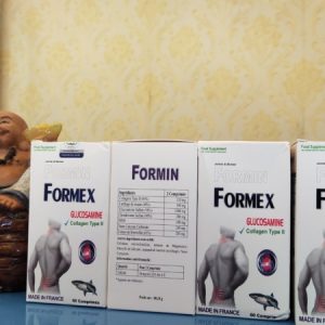
CVARA – NHẬP KHẨU PHÁP – GIÚP PHÁT TRIỂN CHIỀU CAO VÀ PHÒNG CHỐNG LOÃNG XƯƠNG.
CVARA – NHẬP KHẨU PHÁP – BỔ SUNG CALCI NANO VITAMIN D3 VÀ MK7 – GIÚP PHÁT TRIỂN CHIỀU CAO VÀ PHÒNG CHỐNG LOÃNG XƯƠNG.
– Bổ sung Canxi nhằm hỗ trợ phát triển chiều cao cho thanh thiếu niên trong độ tuổi phát triển chiều cao, giúp xương chắc khỏe, phòng ngừa còi xương ở trẻ em
– Chống loãng xương, giúp phục hồi xương gãy, giảm đau lưng cho người lớn, ngăn chặn các hiện tượng thoái hóa, giòn xương do thiếu canxi trong máu, giúp cơ thể khỏe mạnh
– Giảm tình trạng viêm khớp, thoái hóa khớp. Cung cấp canxi, vitamin D3 cho phụ nữ có thai và cho con bú. Tăng cường và phát triển hệ xương ở thai nhi
– Giảm tê bì chân tay, chuột rút. Kết hợp hỗ trợ điều trị thiếu canxi huyết
CAM KẾT HÀNG CHÍNH HÃNG – GIÁ CẢ HỢP LÝ – TIẾT KIỆM 5-7% – GIAO HÀNG TOÀN QUỐC.
CVARA – NHẬP KHẨU PHÁP – GIÚP PHÁT TRIỂN CHIỀU CAO VÀ PHÒNG CHỐNG LOÃNG XƯƠNG. quantity
Mua Hàng


